
Driving AI-integrated SaaS experiences, leading cross-functional teams to deliver collaborative B2B/B2C solutions aligned with business goals and user needs

Michael Tsay
Visual Design
Information Architect
Photographer
Duration
2 Week Design Sprint
Tools
Figma
Sketchapp
Omnigraffle
Adobe Photoshop CC
OVERVIEW
I worked with 2 team members focusing on synthesizing research findings into patterns and insights to inform design decisions towards a feature redesign of the AllTrails iOS mobile app.
Duration : 2 Week Design Sprint
PROJECT PLAN
I put together a project plan that included :
- Work agreement and the scope of the project
- Timeline of the design phases and the definitions
- Defined the roles and deliverables
- Conducted daily meetings & stand ups
Problem statement
Astrid just moved to Seattle and needs to find easy hiking trails in her area. She wants to get out of the city to clear her head and explore what the Pacific Northwest has to offer.
Solution Statement
By redesigning the landing page to be more accessible for different user needs, it achieves a more user friendly experience. We will know this to be true when app downloads increase, more hiking trails are logged, and more sightseeing spots are shared.
RESEARCH

Heuristic evaluation
I downloaded the app and I screen-capped every screen during the onboarding process. That way I had a time stamp on how long it took during this process as well as all the visuals the user comes across. I reviewed the app and wrote down some possible comparative analysis apps to look into.
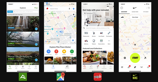
The researcher provided the team with this competitive & comparative analysis on landing pages.

Competitive Analysis

Comparative Analysis

User Interviews :
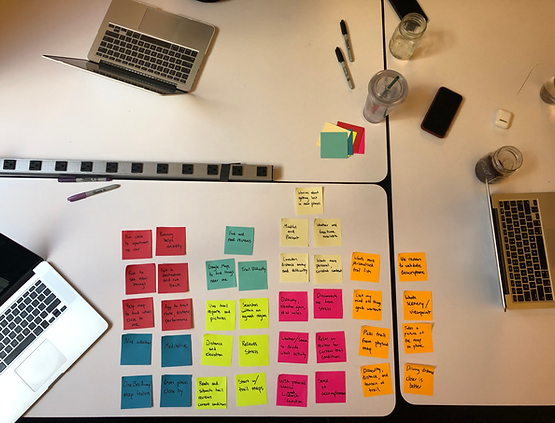
The researcher put together an interview script and questions. We took the script and conducted user interviews at Pike Place Market and Left Bank Books with some employees and local market goers.
I started gathering the data from the interviews and the team started synthesizing the data by working on an affinity map.
With the insights we gathered and the patterns identified, a problem statement and contextual scenario was formed. I put together the visual design and layout for the persona.

PERSONA

Contextual scenario
Astrid is a recent transplant to Seattle. Since she’s new to the city, Astrid wants to explore the Pacific Northwest and she needs driving directions to the trails as well as maps of the trails.
Business goal
All Trails mobile app has an opportunity for improvement on their landing page. It needs to be easily navigated by the user which will increase onboarding and most of all, gain returning users.


WIREFRAMES
I conducted multiple rounds of user testing and screen recorded the session with the iterations of the wireframes provided by the Interaction Designer.
SITEMAP
I put together a sitemap that included the primary navigations along with the portion from our redesign.


DESIGN STUDIO METHOD
After the first round of iterations on the wireframe, we wanted to focus on the landing page. I ran a design studio method to generate some concepts.
6-8-5
Create six to eight drawings in five minutes for a predetermined problem which in our case, the landing page.
Critique, Iterate, Repeat...


We generated over 15 concepts and after multiple rounds of iterations and critiques, we took our findings and discovered some patterns. I took the insights and concepts from the design studio method into our high fidelity prototype.
VISUAL DESIGNS
I put together a style guide before going into the high fidelity design of the prototype.

CLICKABLE PROTOTYPE
I finished designing the high fidelity clickable prototype and began conducting user testing. The carousel concept generated from the design studio method exercise responded well during user testing. It eliminated the 500 result scroll on the landing page and users were able to complete their task during our navigation testing.


NEXT STEPS
Opportunities are in the filters page. Research is needed for best practices on UI's within the filter page. The improvement on the filter page can be brought into the maps page and it will ensure returning users.
Since AllTrails offers more than just hiking trails, I set up a test photo shoot to capture images of the designations from the trails and the activities that are offered. These images can gain new users and also be used during onboarding process to show the users the different ways this app can be used.
RECAP & REFLECTIONS
I've always enjoyed the UX Design process more when it's completed by collaborating with team members versus completing a project on your own.
As a designer, I’d like to eventually learn more on putting different teams together for different projects. I have the ability to see potential in each designer and get the best version of them for a particular project. Pull out what is valuable and show them they have it and how to put it towards a project.


Photographs © Michael Tsay 2021
(End of Case Study)